
News Reader Product Focuses on Building Reading Habit

Ivy is a new take on News Reader App that aim to build reading habit.
Introduction
This is a product design case that I have started during my education at UCLA Extension’s UX Design Certificate. My mentor Thomas Dillmann at the mentorship course had briefed me on the task, and I continued to develop this product after the class finished. I was tasked with designing a news feed reader App, building the complete flow of the product, consider navigation, a feature that will set the App apart from its counterparts, and on top of that, a heavily branded product.
I was in charge of product design with the project and I have worked closely with Thomas Dillmann and Yvonne Liao for their user testing feedback and advice.
The Challenge
Many can agree that news is an important part of their daily routine, and everyone has their own preferred way to read their news. A couple popular go-to are Google News and Apple News, some people prefer to get their news on social media like Facebook and Twitter. Undeniably, there are already excellent news reader Apps out there that have a huge user volume. The challenge here is to design a product that can really differentiate from the big names, by finding a niche feature that others have yet to offer.
I also think that it is important to have a strong branding identity for this App to stay away from being “just another news reader App”. More of this to follow below.
Constraints and Limitations
When discussing with Thomas - My mentor on the constraints and limitations of this product. We tapped into what are the “must have” and what are the “good to have”.
Good to haves
A system to keep the huge amount of news organized
A feature unique to the app that will enhance the user experience
Must haves
A news feed of news articles
Topics that group similar news
The ability to follow media and people
Approach
It all start from the home screen
Ivy has a pretty straight forward navigation. The home screen has the news feed that always displays the latest news. Users can sort and filter to take control of what to see on the news feed. This is also a starting point for users to “branch out”. Simply click on an article to view the full content of it, or click on avator of the writer to see other news articles he / she has written, or look at content from a specific media only.
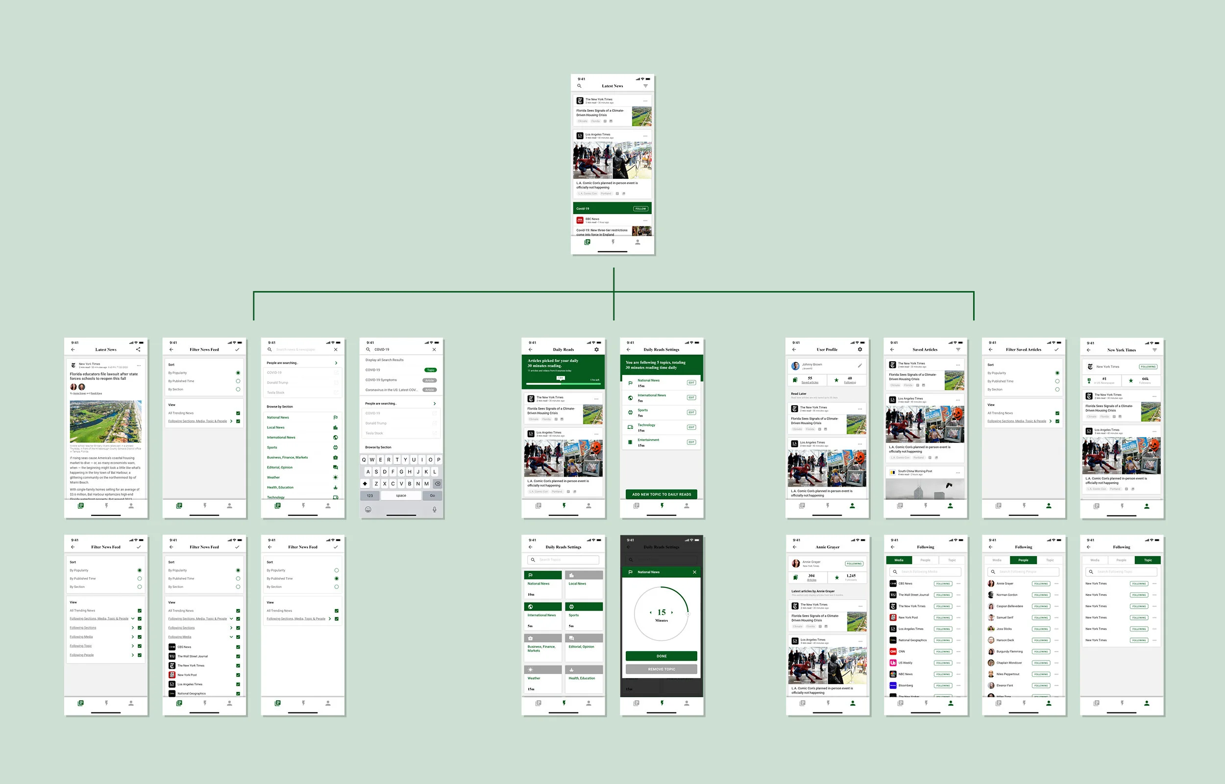
Users can brand out to a whole world of news from the Home Screen.
Branding Ivy
With years of experience as a graphic designer, I am passionate about brand identity. Probably my favorite part of graphic design is developing a brand identity that tells a story, and conveys message, value and function of the product. It has become a common practice for me to brand the products that I make, and I have found it very good at enhancing the overall experience of the product.
I have named the product “Ivy”, taking inspiration from the prestigious Ivy League, giving a sense of academic excellence to the product. As this is a product that the users will engage in while reading the news, I want this experience to be something that they will take pride of, and the elitism of “Ivy League” is going to promote that.
From the name I purposely only used the word Ivy because:
Although the product is taking the academic sense from “Ivy League”, it is not an education product, nor have any relation with the universities, it is best to be kept discreet.
Ivy as a plant - start from a root and branch out to a network of vines, mimicking the functionality of a news feed reader product

Ivy is inspired by the plant Ivy and Ivy League schools.
Design Elements
Color:
A darker green that resembles the color of ivy
Font:
A serif font reinforces the academic theme

Ivy’s branding uses color and font to convey its brand values.
Simplified Navigation
The product has a simplified navigation, all functions and sub pages are housed in three main pages:
home (news feed)
Daily Reads (the App’s main feature)
User
This was purposely done to limit the choices users need to make, so they spend less time choosing what to see but actually be immersed in their feed.

The three main screens at the bottom menu bar houses all content and interactions.
First Take on the Home Screen
In the first iteration, the homepage shows the latest news that the user is following, news articles are all displayed in the same size and template, a serif font is used for the article title to give an academic sense. Carousels are used to group news articles under the same topic. Changes were made to this format after user testing, more to follow below.

First iteration of Ivy’s Home Screen.
Making Use of News Articles
Users are given the freedom to choose what to do with the news articles they like, one click on the “kebab” icon opens up the menu with actions such as saving the article, reading later or see related news articles.
Ivy lets users follow any media or writers, it follows a similar user pattern from Instagram that users are already familiar with, so that users can quickly adapt to the App with no to little learning curve.
Solution
Daily Reads - Building user habits
As mentioned above, the challenge for this product is to find a niche feature that set the product apart from its competitors, and using this feature to help users engage in news reading.
Daily Reads works on top of the already fully functioning news feed feature. Daily Reads help users to engage in the habit of reading news daily, by letting users set a daily reading goal, and display the most important news for them to read within that time frame, aim to help users build reading habit.

Insert iteration 1 of Daily Reads
User Testing
User testing was done to study users’ feedback on overall user experience and the Daily Reads feature, with the following findings.
Topics
Topics are displayed as a carousel, which has a gesture of swiping to the right. It goes against all other gestures used (swiping up and down). Almost all of the contents are hidden and must be accessed by swiping to the right, it creates a missed opportunity for users to see news articles under the topic at a quick glance.
News Articles
The news articles are displayed as same sized tiles. The lack of variation in size and formatting creates cognitive overload. Users lose interest and lose focus on what to see after a short while. Moreover, only displaying news articles on the news feed is not relevant in today’s online world, as media companies using photo galleries and videos to tell their story have become the norm.

insert news articles of first iteration
Daily Reads
Users would like to see more extended features from the Daily Reads page as they were really interested in this function. They were interested in knowing exactly how they would set up the amount of time and preferences of their daily reading.
Reinventing the Home Page
From what I have learnt from the user testing, it is imperative that the news feed include photos, videos on top of news articles and topics. The tiles are enlarged so that less is displayed on screen at one time, in order to help users focus on what to see and finding content that interests them.
Size and Format Variations
Tiles from the news feed now come in different sizes according to the content it displays. The added varieties help keep the feed stimulating and enhance reading interest. Tags are added for users to quickly jump to related news articles. Title of content is changed to a Sans Serif font to enhance readability.

Insert variations of tiles
Extending Daily Reads
The Daily Reads is a well perceived feature of Ivy, users are curious how this feature works in real life. In this iteration, I extended the wires for Daily Reads to demonstrate the set up of this feature.
From the dashboard of Daily reads settings, users get an overview of the existing settings, he / she can edit them, or choose to add new topics. A dial is used to quickly adjust desired minutes for each topic. Users can also add or remove any topics he or she is subscribed to.
